Choosing a typeface that helps children learning to read
Note: This post was originally published on the Shiny Things blog.
I have a vivid memory of sitting in the kitchen one afternoon reading a book that I had brought home from school. It was a book specifically intended for children learning to read and had been handed out to everyone in my class.
As I figured out each word, I noticed something odd about the lowercase ‘a’ in the book. It was very different to the way we had been taught to write a lowercase ‘a’. I spent the rest of that afternoon trying to figure out how to draw those double story ‘a’s.
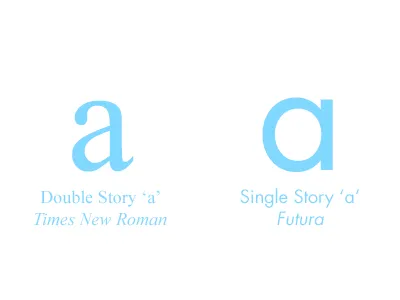
Finding the culprits
While designing the interface for Shiny Picnic we quickly realised that none of the built in fonts worked particularly well with the graphical style we had created. Initially we were using Helvetica but it was clear that we needed something with more personality and character. Two of the typefaces that first came to mind were Helvetica Rounded and VAG Rounded. We quickly ruled out Helvetica Rounded because it only comes in Bold variants.
As I started looking for alternatives I recalled my experience learning to read and realised we needed to choose a typeface that looks as much as possible like the lettering children are taught in school. Obviously this meant we needed to start with a sans serif typeface, since the only time anyone would be taught to draw serifs when writing is if taking a calligraphy class.
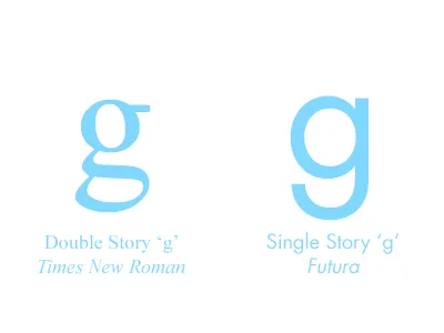
Googling around for details on typefaces specifically designed for children learning to read I discovered that a single story ‘a’ wasn’t the only glyph we needed to look out for. The lowercase ‘g’ was also mentioned, along with a few other characters.
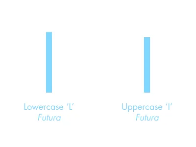
Looking at all the letters of various typefaces we were considering in Extensis Suitcase, we also remembered the common complaint that lowercase ‘l’ and uppercase ‘I’ are often easily confused.
At some point my research also brought to mind readers with special needs or dyslexia. People with dyslexia often have difficulty distinguishing letters that are identical to other letters when mirrored or flipped.
A lineup of troublesome characters
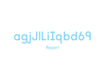
From all these examples, I compiled a string of characters that includes all of the problem glyphs we need to look out for in our search for a typeface. The string we ended up using to test typefaces on various type websites looks like this: agjJlLiIqbd69
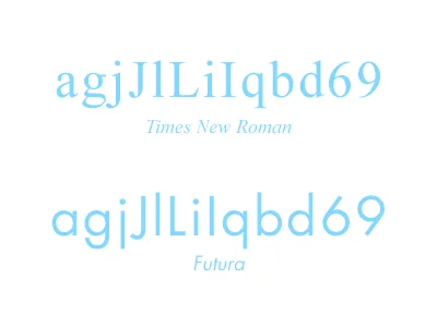
Each of these letters and numbers have one or two issues to consider. The first two letters I’ve already mentioned, the lowercase ‘a’ and ‘g’ should be single story.
Occasionally you will come across a typeface with a lowercase ‘j’ that looks like a lowercase ‘i’ with a slightly longer stem. The problem here is pretty clear, so the ‘j’ should have a curved arc at the stem. Finding an uppercase ‘J’ which has a distinct arm, like an uppercase ‘T’, is a bonus.
The next group of letters is, again, fairly straight forward. As mentioned earlier, you should make sure there is no ambiguity with uppercase ‘I’ and ‘L’ and lowercase ‘i’ and ‘l’. Uppercase ‘I’ should have arms top and bottom.
The last group of letters and numbers are problem characters for readers with dyslexia. When the lowercase ‘q’, ‘b’ and ‘d’ are flipped or mirrored they should be easily distinguishable from one another. In the case of lowercase ‘q’, this means having a tail on its descender. For lowercase ‘b’ and ‘d’, one of the characters should be without a spur where the stem meets the baseline, usually the ‘b’.
The last pair to watch out for is ‘6’ & ‘9’. The number 9 should be a circle with a straight stem. This has two advantages. Firstly, children are taught to write the character with a straight stem, and secondly, it becomes distinctly different from a flipped and mirrored ‘6’, helping readers with dyslexia.
In some European countries children are taught to draw ‘7’ with a cross stroke which you may also want to consider, although this is unusual in most typefaces. The typeface we ultimately chose does not include a seven with a cross stroke, even as an alternate character.
Narrowing down the options
After taking all these exceptions into account you’re probably thinking that there aren’t many typefaces left to choose from, and you’d be right! We had already ruled out VAG Rounded based on this criteria. This is the short list of typefaces we ended up considering:
- Sassoon from Monotype
- Report from Typodermic
- Heinemann from Fontsworks UK
- cambridge-round from aviation
- Hiruko from thinkdust
- chevin-std from g-type
- OpenDyslexic from Dyslexic Fonts
If aesthetics weren’t a consideration the best of these options would be Heinemann, as it is specifically designed for children and has very distinct glyphs for each of the characters.
Since we had to consider how the typeface works within the aesthetic style of Jungle Picnic, our top choice ended up being Report. It fulfils most of the requirements for characters that are reminiscent of those children are taught when learning to write and was the best aesthetic fit.
As an additional bonus, the licensing terms from Typodermic regarding embedding in software are very generous, compared to other foundries:
“Typodermic Fonts can be embedded in software as long as the end user can’t use the fonts to create something. Most font companies require custom licensing for this type of situation. Not Typodermic. We’re rapidly approaching an age where using fonts for printing on paper is the rare exception and embedding in applications is normal use. Yet, most font companies require a custom agreement for use in software.”
We think we have found a great typeface that balances both of our requirements; helping children learning to read and write, whilst looking great in Jungle Picnic. If you’ve found a good typeface for children learning to read and write let us know and we’ll add it to our list.