Before & after
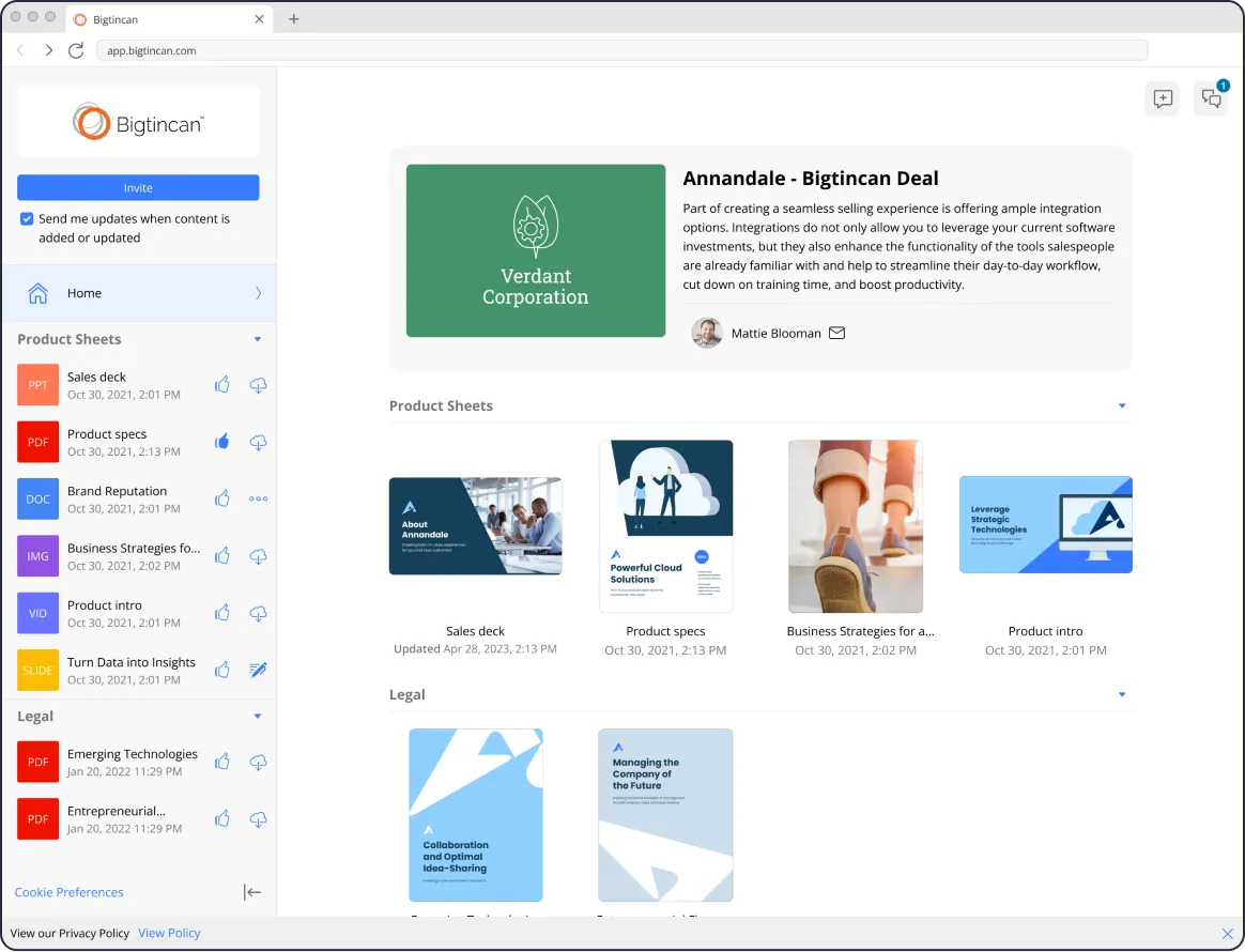
Landing page & file viewer
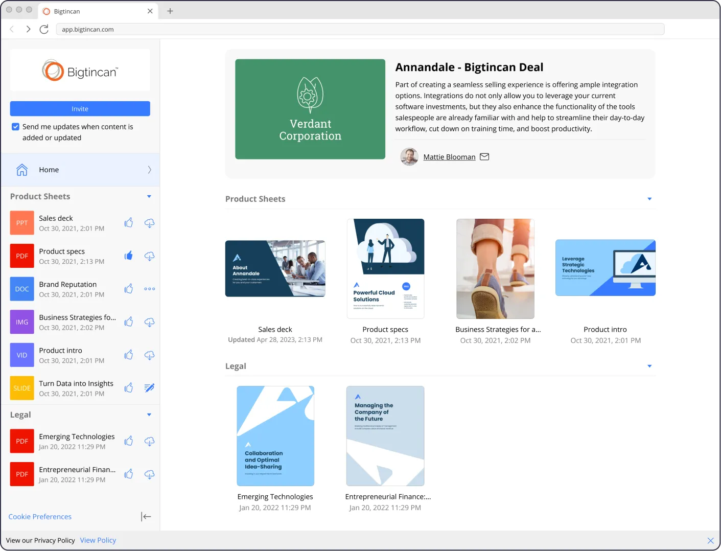
Before
Landing page & file viewer
A redundant sidebar adds clutter and creates confusion in the file viewer.

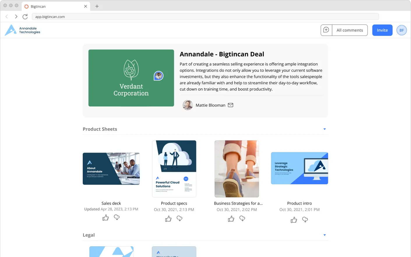
After
Landing page & file viewer
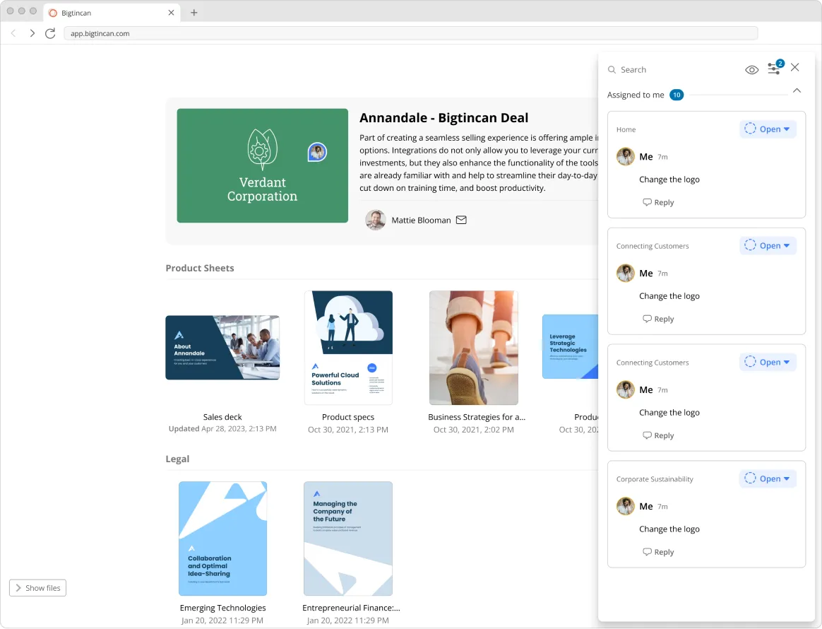
Sidebar removed from the landing page and file viewer.

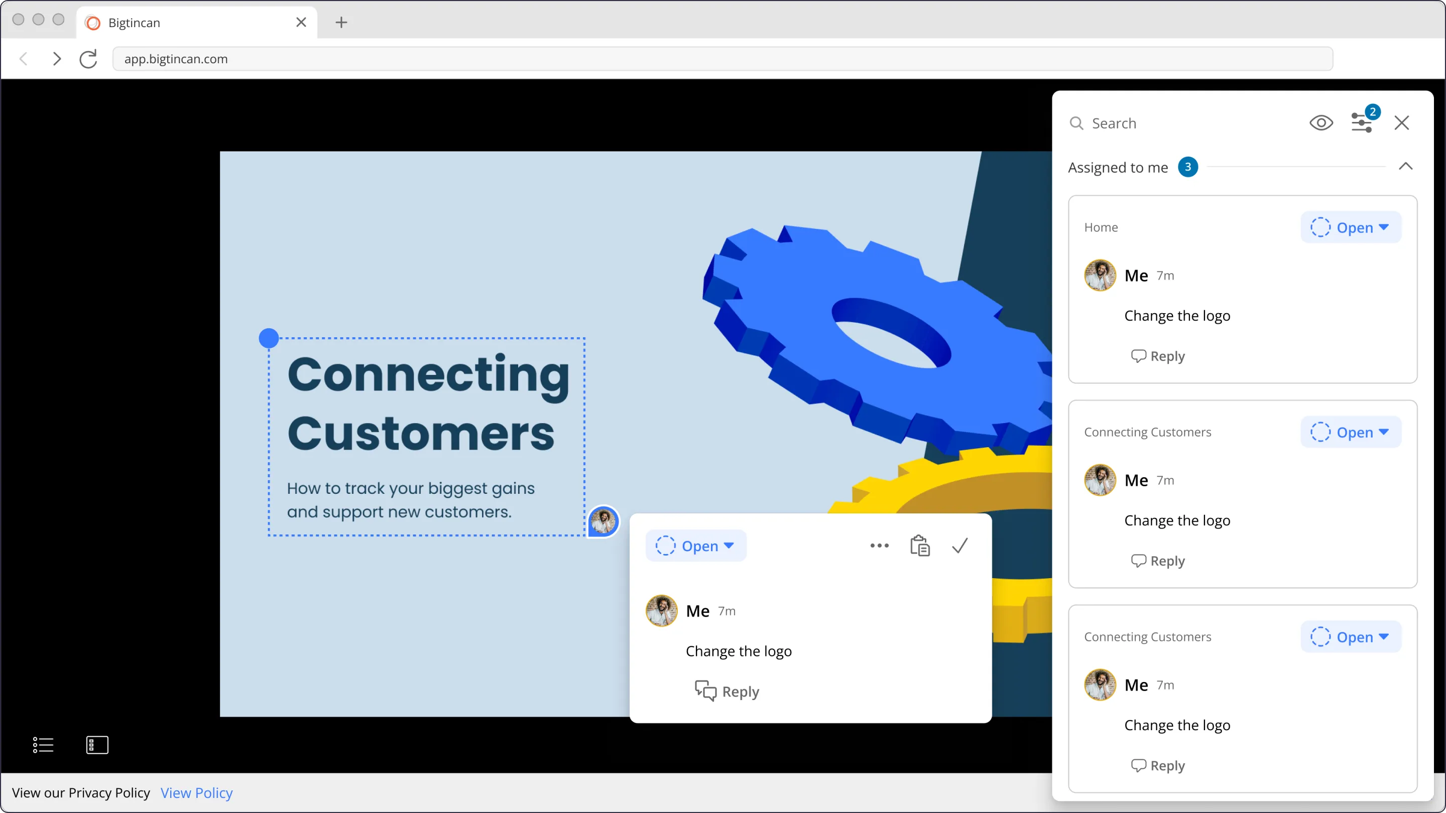
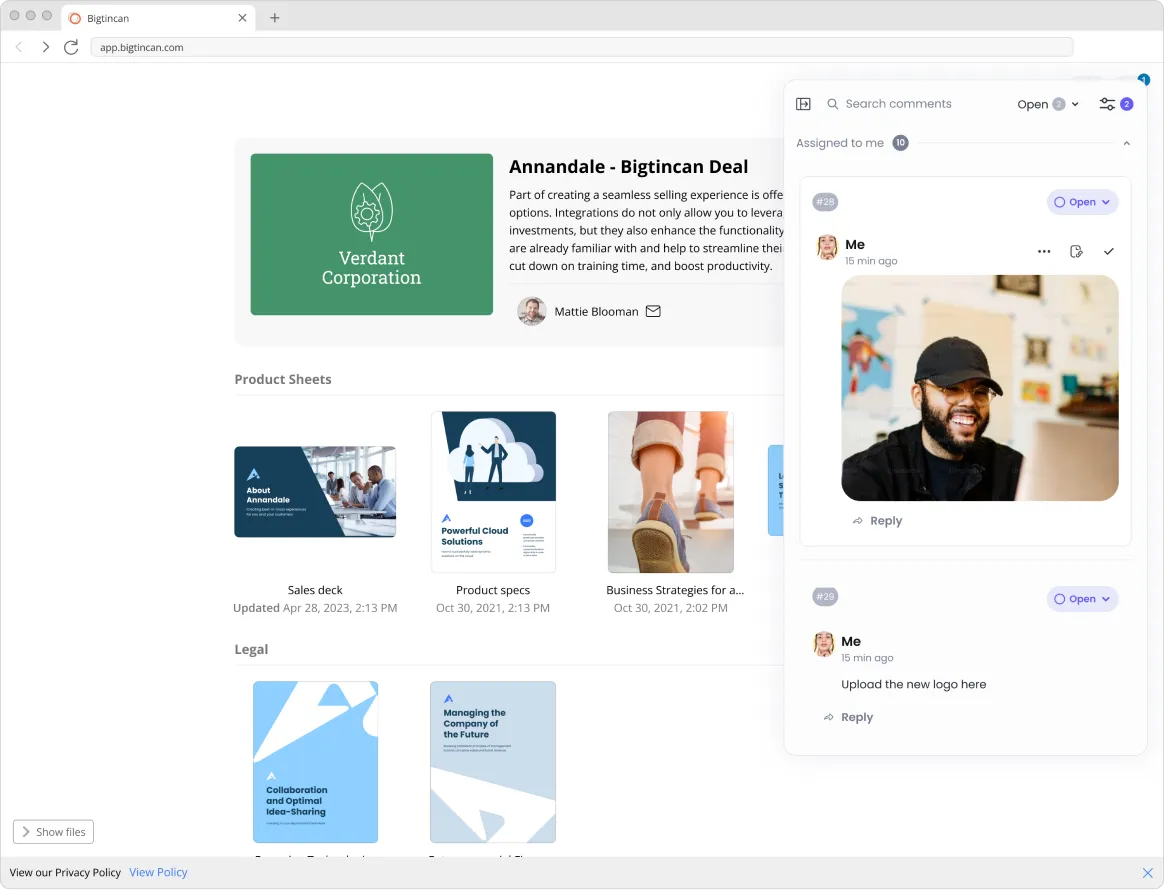
Customers need to respond to Buyer queries promptly to progress sales. When Buyers entered a Digital Sales Room there was no way to connect with anyone. Buyers can email the Seller, but email immediately takes them out of context.
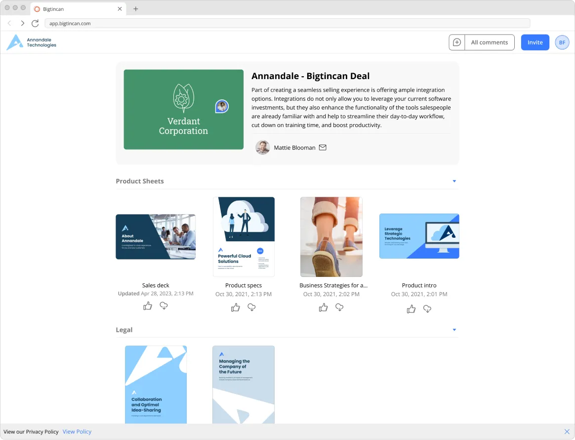
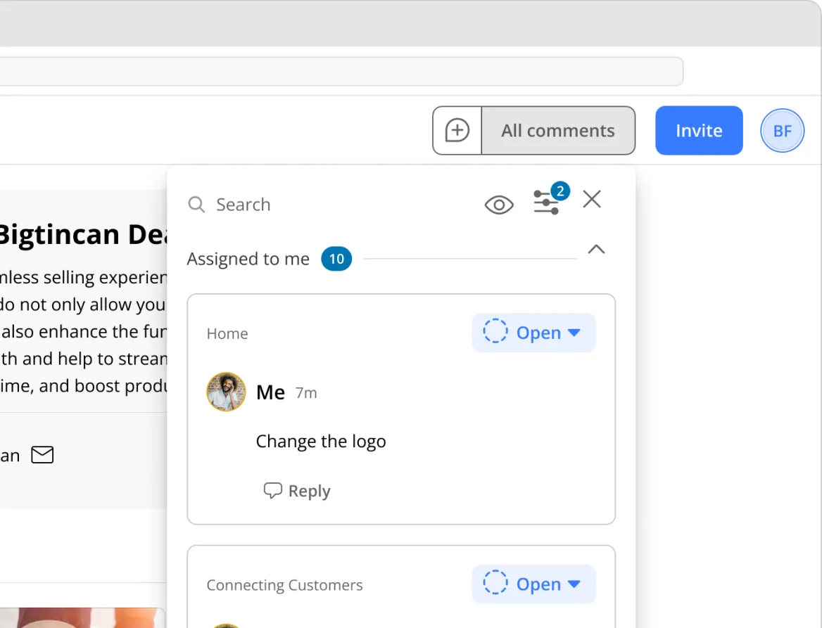
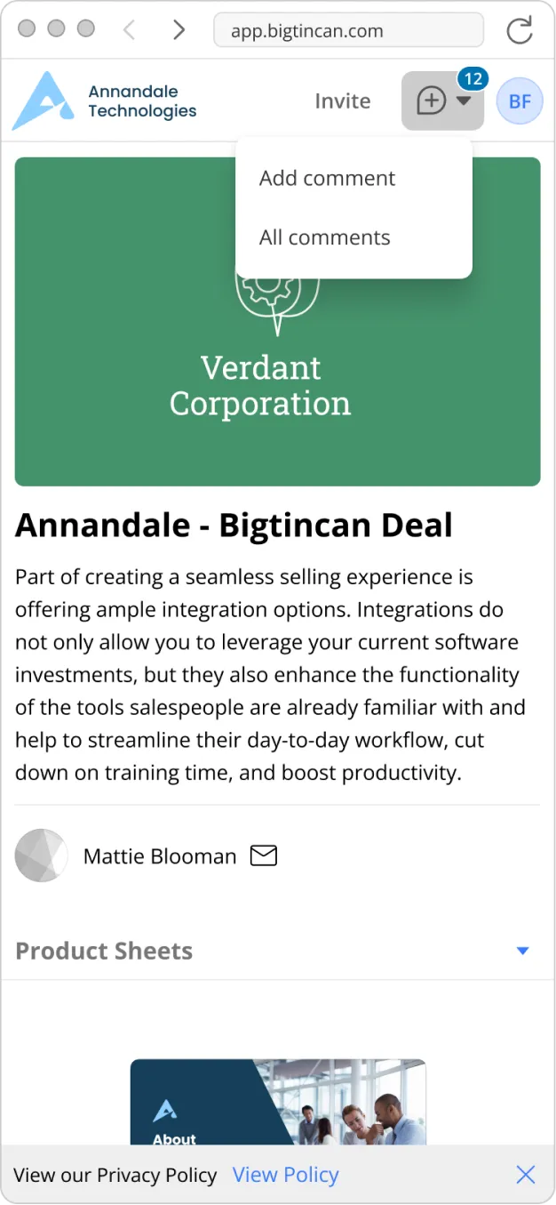
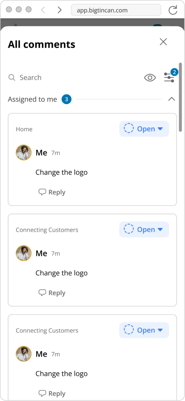
I redesigned sales rooms with comments and notifications and removed the sidebar to resolve some outstanding UX issues in the Buyer view.
Before & after
A redundant sidebar adds clutter and creates confusion in the file viewer.
Sidebar removed from the landing page and file viewer.
Scope
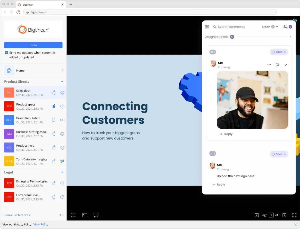
The requirements started from the vendor’s full suite: multi-player pointers, comments, tasks, presence and notifications. I reviewed collaboration patterns and wireframed a flow for each tool. Buyers view shared documents rather than co-edit them, so only comments and notifications earned a place. Cutting the rest reduced the scope of the requirements by an estimated 60%.
First iteration
Adopting stock Velt components to the existing landing page and file viewer.


Second iteration
Restyled Velt components were added to the design system.
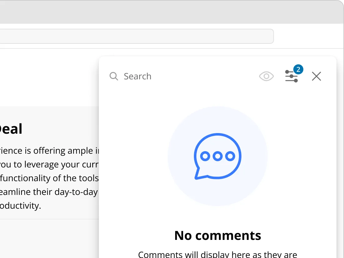
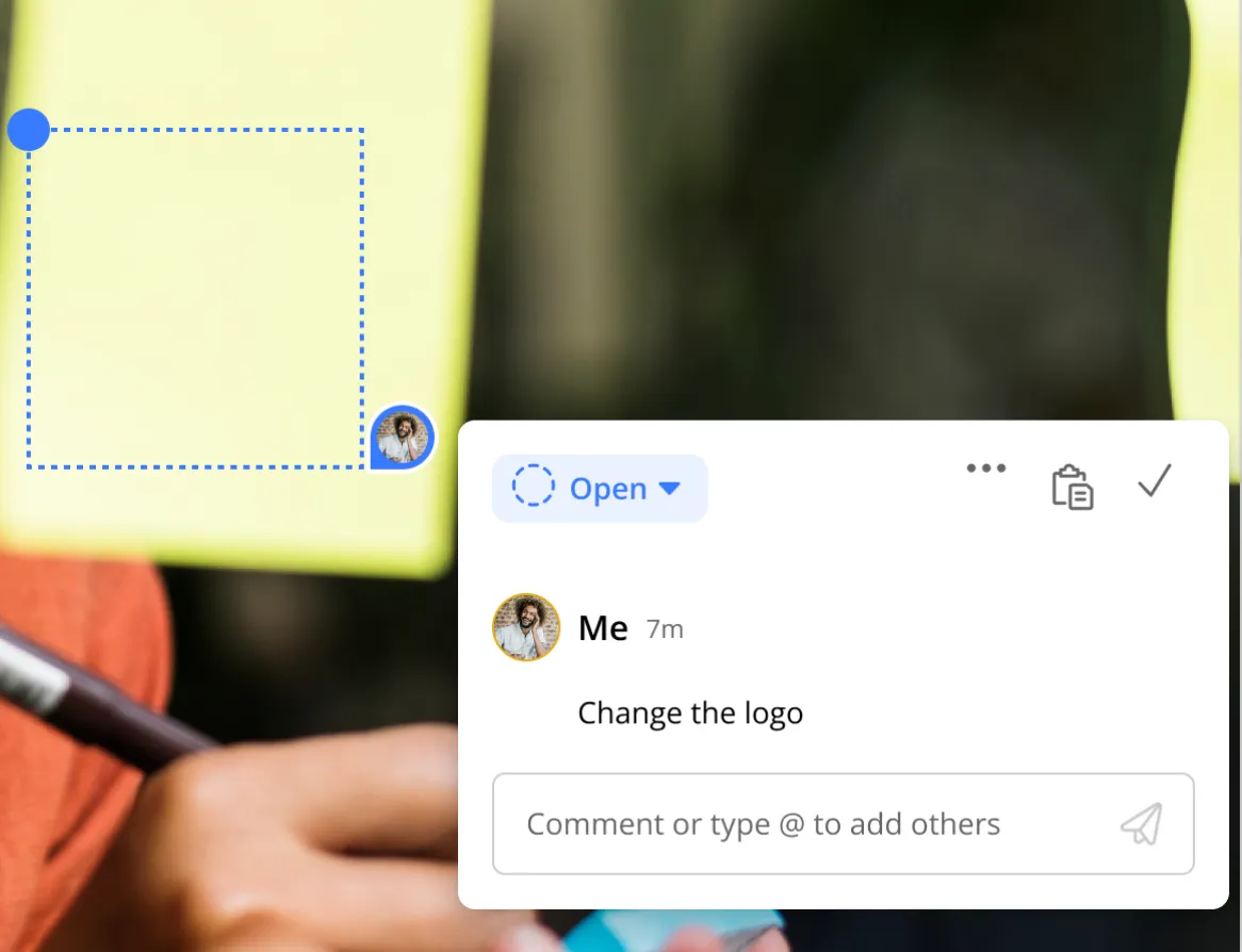

Final iteration
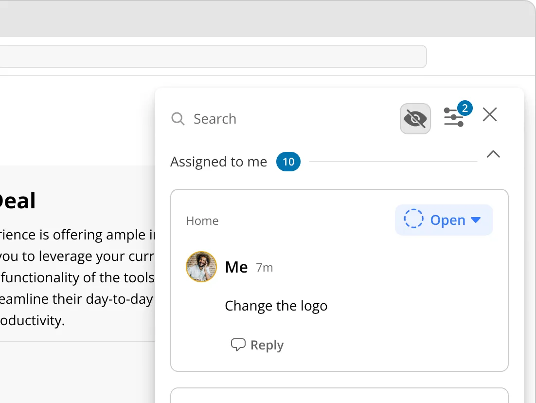
The sidebar is replaced with a toolbar on the landing page.

Outcome
Comments and notifications shipped. Presence was designed but did not ship. Beyond engagement, consolidating communication that was previously scattered across email and messaging apps creates a data foundation that could support AI agents in the room.
Increase in Buyer revisits after release
Rise in weekly Digital Sales Rooms usage over about 17 months, normalised for a layout change
Private rooms, templates, and role-based collaboration features also delivered
