Content Management Modernisation · 4 min read
Our highest-value customers had the most friction when managing content
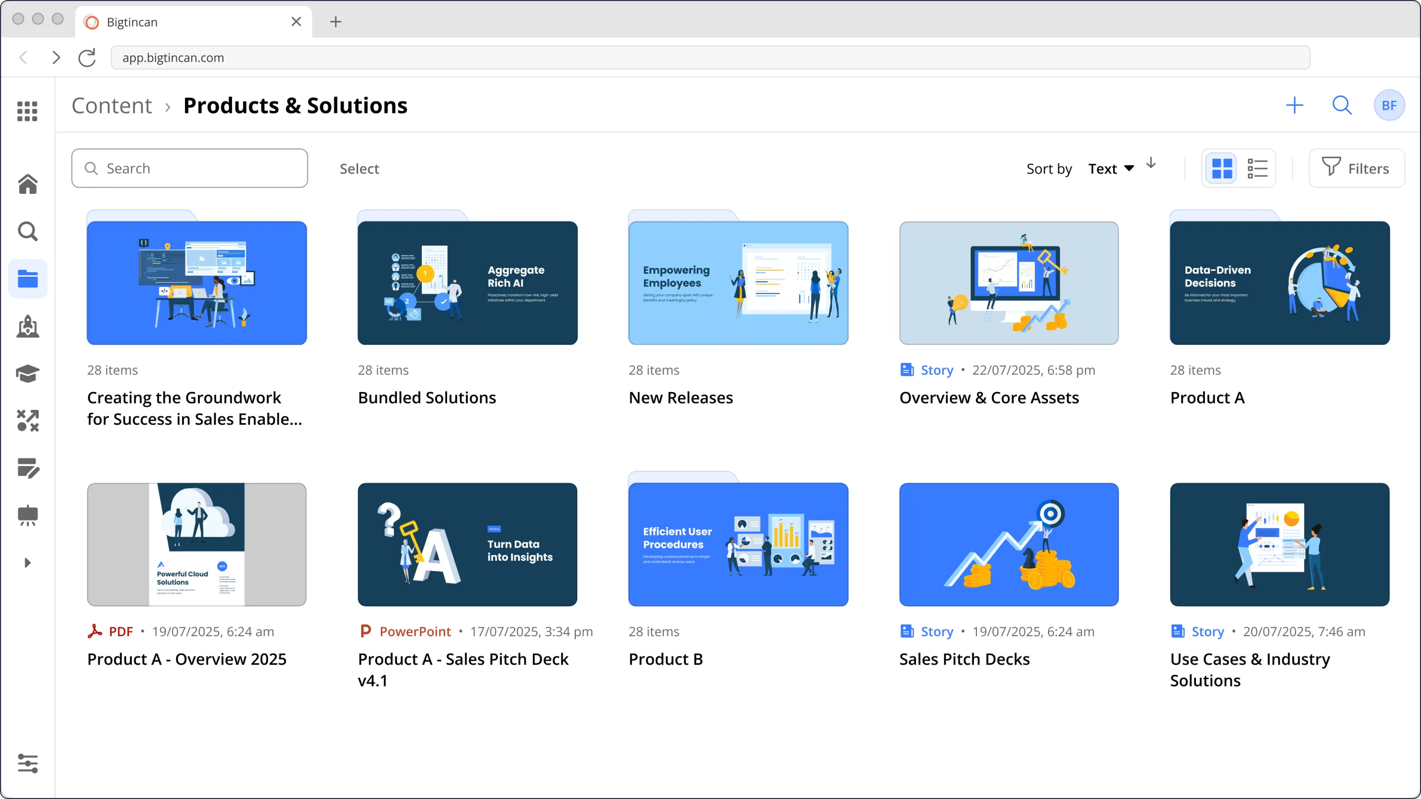
Bigtincan’s Content Hub is a CMS that ensures sales people find the right content at the right moment.
Before & After
Problem
- Customers are forced to reorganise their existing content structure to fit a rigid 4-tier hierarchy.
- 20% of customers were managing more than 7500 files.
- Our highest-value customers were managing over 300,000 files.
- Customers use spreadsheets just to understand who can access which content.
The Redesign
Solution
I redesigned content management so that customers can create a hierarchy that matches their organisation’s existing content structure, and manage permissions in the same UI and aligned with their expectations for managing files and folders.
Before
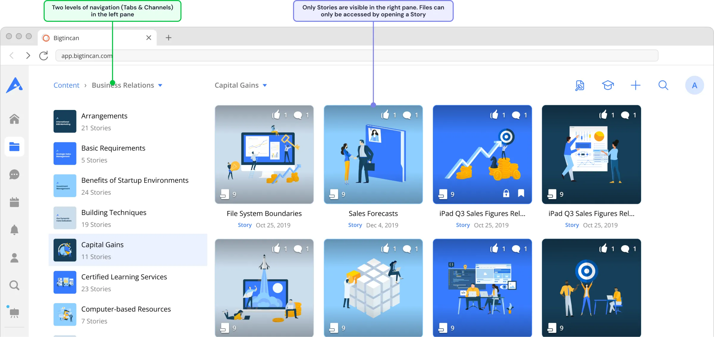
Content Tab
Files are managed separately from structure and permissions, split between the content tab and platform admin, requiring customers to jump between them.
Files can only be stored inside a Story, at the bottom level of the content hierarchy, adding multiple clicks to find any file.
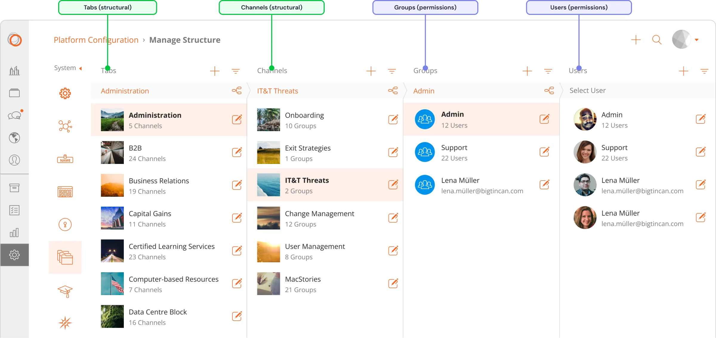
Platform Admin
Managing structure (tabs & channels) separately from content makes it difficult to know who has access to which files, and requires a multi step process to set or update permissions.
After
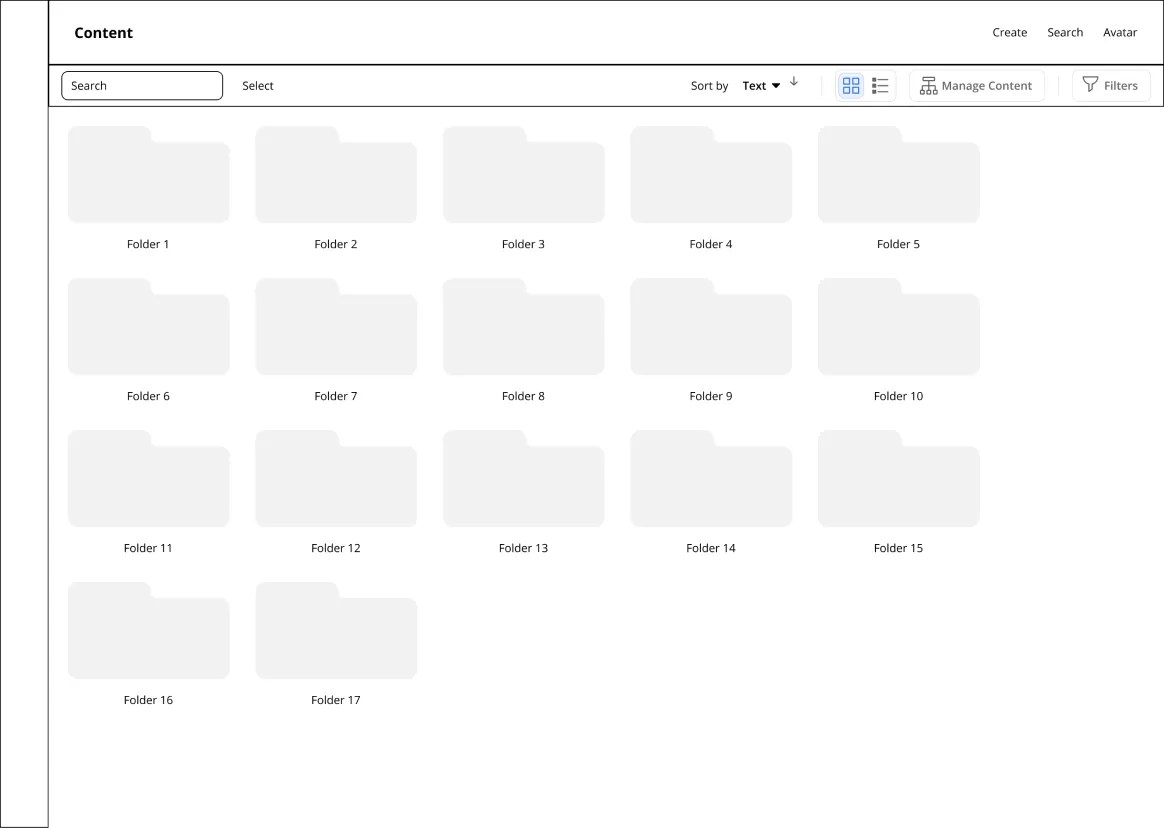
Single pane content browsing
Navigating the hierarchy moves from a side pane to a breadcrumb.
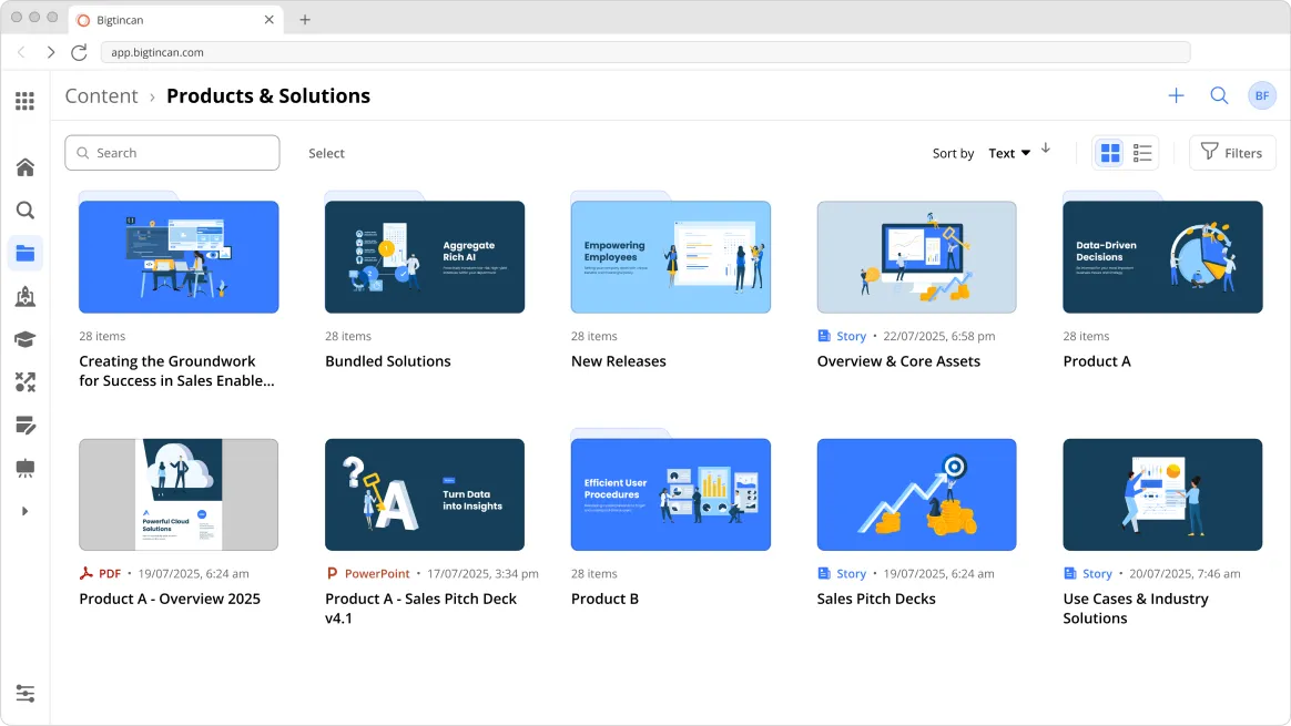
Manage and browse in the content tab
Files can be placed at any level of the hierarchy, reducing the number of clicks needed to browse and discover content.
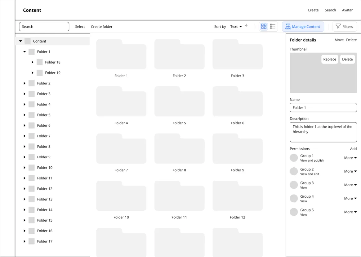
Prototypes
Navigation explorations
Exploring how our existing navigation concept for browsing content would work if overlaid on top of a new architecture.
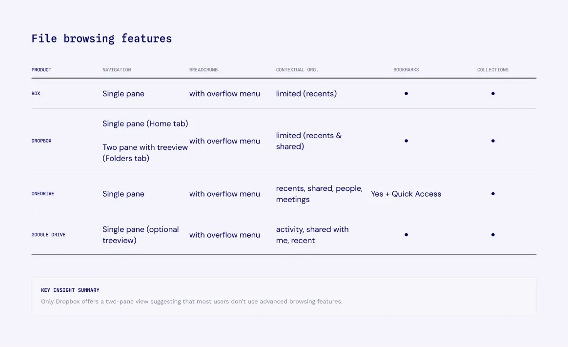
Patterns Research
Cloud file provider analysis
Existing implementations of content management by cloud file providers show that browsing content can be simplified to a single pane with breadcrumb to navigate back up the hierarchy.
A research literature review of hierarchical navigation patterns confirms that most users don’t need complex navigation tools when browsing content.
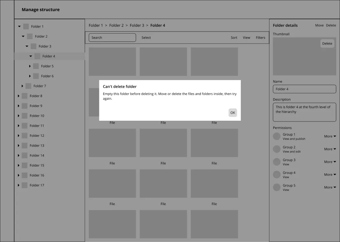
Wireframing
Pressure test gaps or assumptions in requirements
I identified a flawed assumption which I reviewed with the PM. PM agreed and we took it back to engineering.
Final Flows
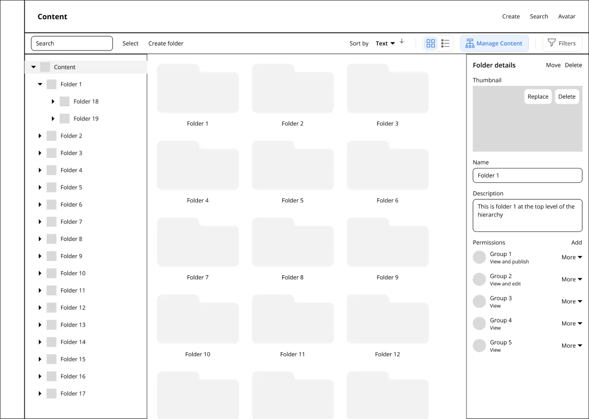
Content management is merged into content browsing
Outcome
Welcome to the parking lot
This project was put on hold before we got to the implementation phase, but the team had designs that were validated, an architectural assumption that was resolved, and a clearer picture of what content managers required at enterprise scale.
Accommodates customers managing large content libraries
Single-pane for content browsers, dual-pane for content managers
Positioned Content Hub to increase growth for enterprise customers